
Two years into this business, the truck finally has a brand that looks the way the coffee tastes. We worked with a designer to rebuild the whole identity from the ground up: a new logo, new colors, new type, and one new little bird who now goes everywhere we go.
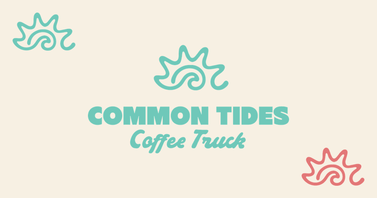
The new primary logo: a sun and a wave, drawn in one continuous motion.
Meet the bird
The new face of Common Tides is a little shorebird, the kind you see skittering along the tide line at Wrightsville Beach. The designer calls this kind of mark an ambassador, and that is exactly the job: the bird shows up on cups, stickers, our website tab icon, and anywhere the brand gets to be a little playful. The sun and wave logo handles the formal duties; the bird handles the charm.
The colors came off the truck
If the new sea foam green looks familiar, that is because it is the color of the truck itself, the same vintage green people wave at around Wilmington. It is joined by a warm coral and a soft sand, and together they feel like a morning at the beach without leaning on anchors and rope like every other coastal brand. The palette was built to be recognizable from across a farmers market.
Coffee with integrity
The new tagline is not decoration. It is the sourcing standard we have always run on: beans from Cerrado Mineiro in Brazil, ceremonial grade matcha direct from a family farm in Shizuoka, Japan, sea salt harvested from Wrightsville Beach seawater, and compostable cups on every single drink. Now the promise is printed right on the brand.
What changes and what does not
You will see the new look everywhere over the coming days: this blog, the booking site, the live truck map, and the main website. The truck itself gets its refreshed graphics too. What does not change: the espresso, the people making it, and the places you find us. Same truck, same crew, same drinks, new feathers.
The short version: new bird, new sun and wave logo, sea foam and coral colors, and a tagline that says what we have always believed, coffee with integrity. Everything else that matters stays exactly the same.